
The first trials, and then images I could visualise from what I was achieving, were disappointing - reminiscent of Images 99 and 100 in the Shape and Pattern Study - as the essence of the gulls was being lost (Image 251 and 252).


Image 251 was over complicated and reminded me of carcasses hanging in a butcher's shop (not the best design for a non-meat eater!) and had totally lost the feeling of the gull. Image 252 just didn't work for me. At this point I traced off the design given in the module and played with it and asked myself why it was working and mine not. I decided it was all to do with the original placement of the lines in the rectangle. I looked again at my rectangles and used the first one on the sheet, using the smaller of the two contours, and began to get better results. I extended lines, lost lines and added the egg shape (Image 253).

Or turning through 180 degrees

Image 254 - Extra lines and shapes drawn in and developed.

Image 255 - Chosen design to manipulate in computer program.

The following images were manipulated in Photoshop Elements 11.
Image 256 - Ink Outlines - stroke length 20, dark intensity 39, light intensity 30

Image 257 - Liquify - brush size 295, brush pressure 68, turbulent jitter 70

Image 258 - Pinch on centre of rectangle 86%

Image 259 - Ripple medium 659%, plus Pinch 86%

Image 260 - Shear - wrap around

Image 261 - Spherize - 95% horizontal

Image 262 - Spherize - 95% normal

Image 263 - Chrome - detail 10, smoothness 2

The following images were manipulated in ArcSoft Photostudio 5.
Image 264 - Distort

Image 265 - Stretch

Image 266 - Weather, Frost, blur 5, length 23, density 10, transparency 10, plus Distort Bulge 50%

In manipulating the designs using computer software I've used the functions that manipulate/distort the image rather than just providing a filter that give it an 'effect'. I've also used filters/functions that have retained the essence of the gull as if the manipulation is too extreme you lose the sense of gulls/flight altogether. I'm hoping the simplicity of the design will be its strength, as with Braque's birds. From the above I chose Image 265 to further explore.
Before the exploration exercises I couldn't resist a little tweak of the design to give a repeat pattern - Image 267...something that might come in useful later!

Design Recipe
Woven textures
Shadows
Layers
Fluidity
Curves
Waves
Movement
Ripped/cut edges
Neutral palette
...and not forgetting..
'Startling Rightness' (thanks to Debbie Lyddon and Sandra Blows)
Series of Small Designs
Images 268 and 269 - use mainly light toned colours, but make one area dark.
I've included two versions as the design was layered, the top layer being oil pastels on double-sided buckram and the second layer tracing paper painted with Anthraquinone Blue Golden Fluid Acrylic, the first concentrated and the second diluted.


Image 270 - mostly harmonious, analogous colours with an area of complementary.

Image 271 - two complementary opposites, equal quantities both opposites.

Image 272 - two complementary opposites, more of one than the other.

Image 273 - reverse of Image 272

Image 274 - same/similar colour groups in connecting shapes to make them look connected.

Use Texture to Translate Fragment
Image 275/6
Top layer - scrim, emulsion, silver and copper PlayArt Metallics
Second Layer - acrylics
The lighter second layer enhances the design as the shadows are visible and the light blue gives a more sympathetic balance of colour value.


Image 277
Top Layer - tissue paper, emulsion, grey and copper metallic rub-ons
Second Layer - acrylics

Image 278
Top Layer - paraffin-waxed kitchen paper, emulsion, silver and copper Playart metallics
Second Layer - acrylics

Image 279
Paperyarn couched to carboard base, Polyfilla etched with cocktail stick, emulsion, silver and copper PlayArt Metallics
Carboard base - Inktense pencil

Image 280 - Image 250 coloured with Inktense Blocks

Image 281 - Image 250 - coloured with Pitt Artist Pens

Image 282 - flip repeat of pattern on monoprint, cut out.
Back to the drawing board on this one as the obvious dominant images in the shadows are not saying gulls to me. Mmmm...interesting!

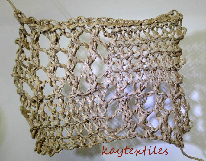
Image 283 - and now for another piece of twining and its shadows.
Paperyarn twined on paper covered cake wire. (Actually, the photographic image is more interesting than the piece of twining.)
