Thursday 25 May 2017

Diploma Module 1 - Costing Materials, Recording Time, Health and Safety,

Due to elapsed time it has taken me to complete this first module, allocating course costs and time is tricky.

Costing Materials

Mmmmm, many of the materials used were already in my stash.

In future, I must keep track of costs in a separate book together with receipts.

But, I have just replenished many of my stationery materials at a cost of £93.78 as I was running low, so it is probably fair to say this is what I've used for the course.

My main new large expense has been a wax pot and paraffin wax  - £79.50.

Polyfilla and interestingly textured things from a pound shop and probably amounted to about £5.

As I'd not used procion dyes before, procion dye starter pack £15.95
Separate procion colours  £11.20
Washing Soda 1Kg           £1.00

Other main new items:

Golden Open Acrylics      £20.00
Acrylic Wax                       £8.75
Block Printing Ink              £9.20

Misc threads and material £10.00

Total £254.38

Recording Time

Based on the routine I managed to get into at the beginning of the year, if I block out the time I can complete a chapter (obviously depending on the content) in two weeks, based on 2x8 hour days per week.  So, for 13 chapters, over the elapsed time I have probably put in about 400 hours. I realise I have gone 'off piste' and done some sewing and other tasks that were not in the programme.

Health and Safety

Any particular health and safety details have been noted as I performed the tasks.

Additionally,
  • keep wires from electrical items away from main thoroughfares
  • take a break and move around at least once an hour
  • keep 'sharps', e.g. scissors, awls, bradawls, etc in cork 
  • wear rubber gloves when using bleach and keep room ventilated
  • dispose of sharps considerately.
Storage of Work, Materials, Tools and Equipment

Design Work in Progress - kept flat in portfolio and easily accessible

Completed embroidery - boxed, wrapped in acid free tissue or framed

Completed design work - kept flat, in folders, in cardboard boxes

Papers for design work -  kept flat and covered to keep clean

Inks - lids secure in rainbow storage tower, attic

Paints for design work - lids secure in plastic crates

Other items like glue, bleach, sprays - lids secure, labelled clearly, away from children and pets

Embroidery work in progress - covered, usually in pillow case, easily accessible

Fabrics - in under-the-bed crates in attic, fabrics in use in reusable supermarket bags

Threads - stranded - wound onto bobbins, by colour, in plastic containers
              - sewing machine - in plastic shoe boxes, by colour
              - interesting textured - in plastic shoe boxes, by colour
              - machine embroidery - on covered stand

Beads - small plastic containers in shoe box

Metal threads - acid free tissue in plastic toolbox

Dyes - lids secure, plastic container

Sewing machines, embellisher - upright, covered, normal room temperature

Special materials, e.g. abaca tissue, lutradur - rainbow storage tower, attic

Printing materials - under-the-bed crate, attic (when not in use)

Lino cutting tools - rainbow storage tower, attic

Other electrical equipment - rainbow storage tower, flex lightly wound, stored when cold.

 Authentication of work

See email.


Nailed It?


Diploma Module 1 - Evaluation of Completed Work

Choice of research theme

As the spider diagram was prepared, the addition of shadows made the scope for investigation richer and more varied.  Alongside the development of ideas, the effect light will have on future pieces has also been considered, so transparency/translucency has been important in my designs, i.e. consideration of the finished piece and how it will integrate into its final surroundings, rather than in isolation on the sketchbook page. This has lead into some 3D work (twining, Paverpol, use of wire).

Use of sketchbook to glean visual information

If people work in different ways, some plan and then produce; some produce then adapt; some plan, produce and adapt, then I am probably in with the first, plan and produce (and only then adapt if the original plan isn't quite what was anticipated).   I'd rather work on paper, making mock-ups if required, and then consider how the piece will develop, than jump straight in.  The use of the sketchbook for me is an essential tool, giving me ideas on which to base future work and continually being expanded.  All the sketchbooks used in Module 1, from small to large and ideas suggested are already providing directions for future work.  They have helped me collected ideas together and as I finish this module I'm still collecting (see add-ons).

Your designs

The only way I can address this is by considering which designs make me excited and want to go on to do more.  In no definite order:
  • the monoprinting Image 141
  • the 'boro' layering section Images 156 - 171
  • the discharge printing Images 194-5 (and see add-ons)
  • the extended work on Image 239 (Image 292 especially - see add-ons)
  • the black tissue discharge batik (Image 367)
  • my tweaked colour palette.
Proposed design ideas

See add-ons for a few ideas I've already started working on. I'm also keen to experiment with working with paper, wire and translucency.

Artists study

Looking at other artists work is a little like going back to a technique book and seeing things in a different way depending on where you current interests lie.  It can take you in directions you never thought of, not to copy but to add-on to your own reservoir of ideas.

The two artists I have looked at have added to my collection and made me revisit techniques I have tried in the past, but now with a different emphasis - gulls with shadows.  Attending workshops with Debbie Lyddon has been even more rewarding - I now think about the quiet space in designs and try to keep things simple.

PS This can also be expensive - I am now the proud owner of a wax pot!

Diploma Module 1 - Add-ons

The following images relate to work that is either additional to chapters in this module, or relevant to the development of my theme.

Images 337 and 338 are from a Paper Lamination workshop with Buffy Fieldhouse, a member of our Guild.  Though the background appears white, it is actually ultra-sheer polyester organza.  

Image 337 is laminated newsprint with cut out gull shapes.  The screen through which the golden matt medium was forced was masked with masking tape in these shapes so that the medium did not adhere the newsprint where the gulls appear (thanks to the Saturday Telegraph travel section).


Image 338 is one of Buffy's photographs laser printed onto photographic paper before being laminated in the same way.


In Chapter 6 - Colouring of Materials I chose the procion dye option.  I recently attended a Transfer Dye/Printing Workshop with Mary Gamester, again with our Guild and include some of the work here as it was based on my theme.

Image 339, transfer paint sponged onto photocopy paper and then masked with gull shape before ironing.


Image 340 - ironed onto voile - you can just about see the image and the wonderful interference patterns appearing on the surface of the material. This could perhaps be overlaid onto a transfer printed image before stitching to 'soften' the image.  It would be interesting to try the same on voile maché as this would give a surface that was less shiny.


Image 341 - ironed onto polycotton (65/35).  Note how, on ironing, the paints have seeped through the mask.


Image 342 - ironed onto satin crepe.


Image 343 - ironed onto American muslin and stitched with kantha and seeding.  It was interesting to note there was very little difference in the ironed image on the muslin and the polycotton, so in future I wouldn't bother sourcing the latter.


 Image 344 - the back...in my opinion much more interesting than the front!  The seeding gives wonderful lines.


Though, not my theme, Image 345 shows two prepared papers that have been woven.  The red was just painted and the yellow was overprinted with a paisley stamp.  


Image 346 - ironed.  Note how the paisley print is showing as a ghost print through the red, as if in shadow...this is why it is included here.


A section of Image 292 was used in the design for Image 347, which is painted on dry paper


 and Image 348, ironed onto polycotton (65/35).


In Image 349 things get more interesting as the image was painted wet on wet,


and ironed onto polycotton (65/35)


and American muslin.  Again there wasn't much difference between the results on the polycotton and the muslin.


Remember my glue gun stencil? - Image 17 - that seems like a very long time ago!.  Here it was used to relief print Image 352,


and iron onto American muslin (Image 353),


and the back (Image 354).


Having just started a new format sketchbook 17cmx11.5cm, Image 355 is thin bleach on sugar paper applied with a nearly dry brush and a polystyrene block


and though a stencil with a sponge, light pressure and harder pressure.


Image 367 - similarly, onto black tissue paper - front.


 Image 368 - black tissue paper - back.


Image 359 - black linen - based on Image 87 - batik with discharge dyeing - front


 Image 360 - batik with discharge dyeing - back


Image 361 - gull pattern - batik with discharge dyeing - front


 Image 362 - gull pattern - batik with discharge dyeing - back


 Image 363 - random gull pattern - batik with discharge dyeing - front


Image 364 -  random gull pattern - batik with discharge dyeing  - back


And now, Tah Dah!
Image 365 - gull and feather patterns - batik with discharge dyeing on black tissue paper - front.  This is where I got very excited as I'm enjoying working with paper so much.


 Image 366 - gull and feather patterns - batik with discharge dyeing on black tissue paper - back.


Image 367 - detail


Image 368 - detail - perhaps this one is a bit busy...


I'm just loving these marks and will experiment further - perhaps to incoporate this with my boro work.

And to finish, from an ecoprinting workshop with Caroline Bell - with every parcel we unwrapped it was like Christmas - 'onionskinsfourways'.

Wednesday 24 May 2017

Diploma Module 1 Chapter 13 - Study of Contemporary Textile Artists

For this brief study, the two textile artists I have chosen to look at are:

Debbie Lyddon (Image 335)


Nicola Henley (Image 336)


Though birds are not the focus of Debbie Lyddon's work, their habitat and environment is and in her blog there are often very descriptive and delightful passages on birds - 'gulls wheel on thermals' being a personal favourite.  In addition, the direction my work is taking is in some ways similar to hers, i.e. limited colour palette, shadows, layers, movement, ripped/cut edges and aiming for that 'startling rightness'.  I have enjoyed two of her courses, Seeing Sound and Stitched Collages (Images 203-206) and next month I'm looking forward to Sculptural Forms.  In comparison, Nicola Henley's work is full of birds and I have had real pleasure in looking at it again with new eyes, particularly how she gives one such a feeling of movement, place, layering and fluidity.

I have only included one favourite piece of work from each as there is so much available on their websites http://debbielyddon.co.uk/  and http://www.nicolahenley.com/  it didn't seem necessary to include it here.

All these studies are being kept in a separate, hard-backed A4 sketchbook.

Friday 19 May 2017

Diploma Module 1 Chapter 12 - Towards an Embroidered Item

STAGE 1 - Choose background

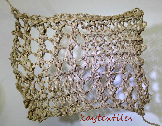
To try to be sympathetic with my theme of 'gulls with an emphasis on shadow', I decided to use rug canvas (large grid) as a starting point onto which I attached builders' scrim (smaller grid).  This I hoped would give me a mesh that the light would go through. Initally I tried attaching the scrim with dilute PVA but all I ended up with was a sticky mess and little adhesion. I then sampled the somewhat limited stitch patterns on my trusty Bernina 1015 Sport in order to attach the scrim with a stitch pattern that would replicate the impression of feathers (Image 315).


I decided on Pattern 13, length 4, varying the width from 5 to 3 (3 being used to fill in some areas to give variety).  This enabled me to attach the scrim.

STAGE 2 - Colour background

I coated both sides of the background with emulsion and then coloured it with acrylic in the style of Image 292 (Image 316).


STAGE 3 - Add detail and pattern with stitching

I had already done this in Stage 1 prior to colouring and wanted to leave the edges raw when cut, rather than stitched as I felt this would be more sympatheic to my design.

STAGE 4 - Cut up into separate shapes

Rather than using individual shapes, which I had already done in previous designs (Image 56 in particular), I decided on the continuous line option to give me strips.
Rather than going ahead and cutting into the background I had created I sampled different lines on paper using the gull outline. I liked the circled shape in Image 317.


I created a cardboard template based on this design (Image 318 - middle section) and cut out the strips from the background already created.


STAGE 5 - Arrange shapes in interesting compositions

In the black and white Image 318 interesting design possibilities from this linear design are clear when the shapes run parallel, perhaps replicating the shape in simple stitch marks onto whatever lies below.  Crossing lines are not used in my designs as they disrupt the flow.

Image 319 - strips staggered 


Image 320 - strips repositioned and staggered


Image 321 - strips placed on top of digital design from container ship on Welland Canal.


Image 322 and 322A - strips placed to frame details on image below (looking out to sea from Turner Contemporary, Margate on visit to Entangled exhibition).


Image 323 - strips fanning out.


STAGE 6 - Make a proposal for a resolved embroidered item

I propose to make a fan as my functional three-dimensional piece as it will enable me to use the gull shape and, due to the nature of the fan and its ability to allow light through the structure, will facilitate the production of shadows from these shapes, something not possible with many other items. Though a fan is functional, I would anticipate static presentation alongside a suitable light source.  The following pages are from my sketchbook (A3 size).

Image 324 - Proposal to make a Gull Fan...the must-have costume accessory for a day at the seaside. (Things will get less frivolous.)


Consideration was then given to the type of fan I might make.

Image 325 - a fixed fan with either a separate or fixed handle.  Though I could place any of my previous design ideas in a chosen fixed shape, this felt rather like putting a panel on a stick and there would not be much scope for construction or three-dimensional exploration, so I'd probably not go for this option.


Image 326 - folding fans, either pleated or brisé.


Image 327 - cockade - pleated example shown though this type could also be brisé. The circular form of this type of fan didn't appeal to me as I felt it wasn't sympathetic to my topic.


So I decided to go for a folding brisé fan as instead of a pleated leaf placed over sticks it has separate sticks held together at the top by some sort of cord and at the base in some way to allow it to pivot. My choice was partly due to the design possibilities I could see Image 323 providing.  The two outer sticks (guards) could also be more ornamental than the others.

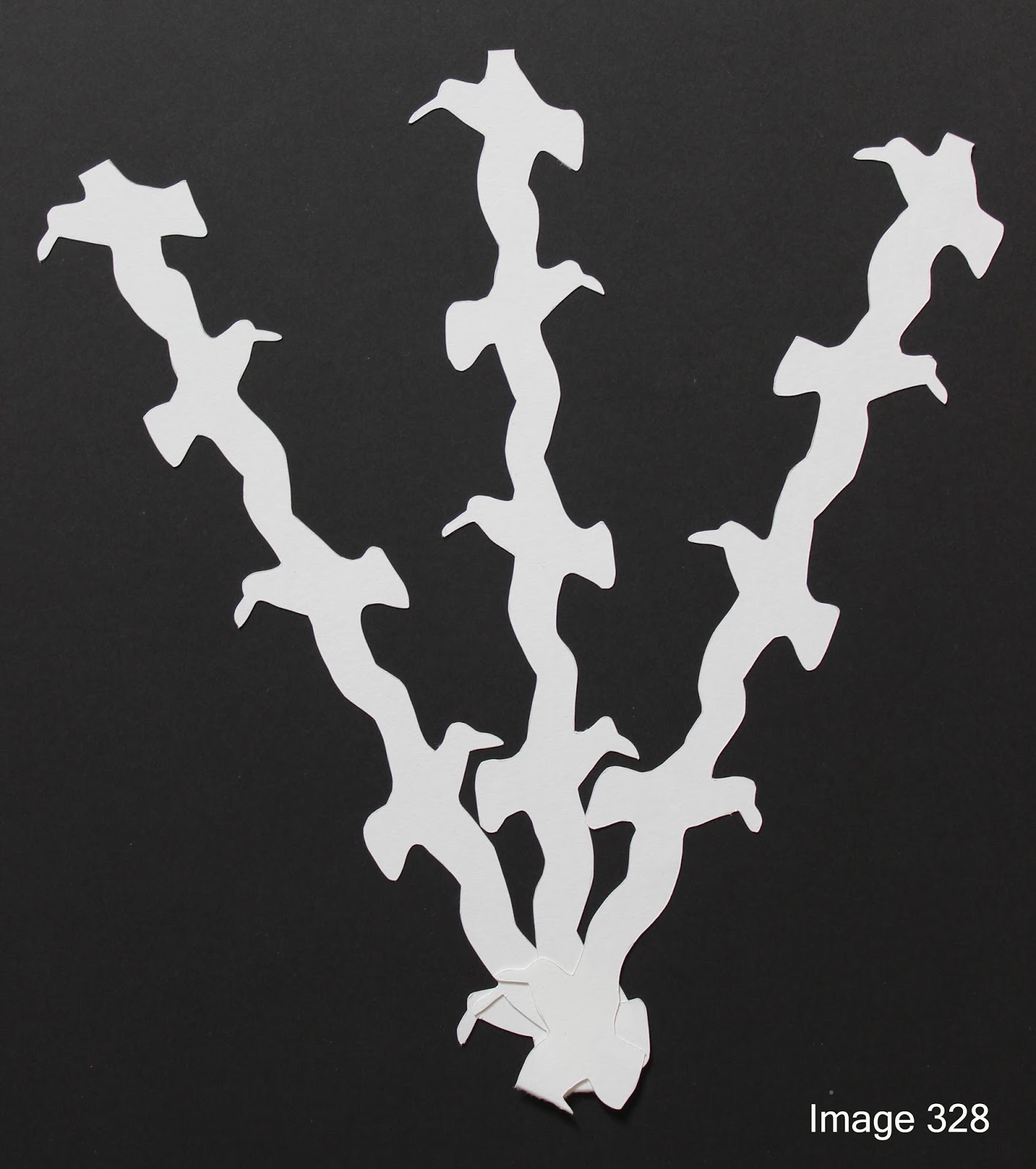
I revisited Image 323 and where it might lead.  This has been done in black and white to make the design elements more pronounced.

Image 328 - opening out the sticks.  Though I like where the first set of birds open out from above the pivot, more work would need to be done on the shadows this is producing.  Also, consideration would have to be given to the tops (and bottoms) of the sticks and how the fan looks when closed - something to think about in all the designs given below.


Image 329 - this is where I think things start to get interesting.  Is you take the negative images around the bird string and use it, there are endless shadow possibilities depending on how much the the fan is opened.  This is based on the birds alternating on the string in the direction in which they face.  I think this is probably a bit busy and it might be simpler if the birds all faced the same way.


Image 330 - bird string where all the gulls face in the same direction.


Image 331 - birds facing same direction fanning out.  Not so successful as they overlap one another near the pivot.


Image 332 - birds facing same direction but staggered placement - better.


Image 333- birds facing same direction using negative images - fanning out...


Image 334 - as Image 333, but fanning out more.


Image 333 and 334 so far appeal to me the most.  I like the fact that when the fan is closed you will have no idea what will be revealed when it is opened.  There is a lot more work to do on this but I think it has possibilities.  One tweak would be to have the sticks more the shape of a thin slice of cake, tapering to the pivot end, than with parallel sides and to adjust the design to fit.

Revisiting my Design Recipe:
  • woven textures could be built into 'fabric' of which it is constructed (as shown in Image 315, though this is just one example)
  • shadows - the placement of the design on the sticks will produce the shadows
  • layers - again this could be built into the 'fabric'
  • fluidity, curves, waves - this might be helped by wavy lines instead of straight lines enclosing the negative images
  • movement - produced by the stitching on the 'fabric' (and you do wave a fan around!)
  • ripped/cut edges - again the structure of the 'fabric'
  • neutral palette - choice of colours
  • startling rightness - I'll leave that one up to you...I'm not sure it's there...yet...